In the previous article, we learned the basic syntax of Astro components. Today we are going to see how to use them and their utility.
We said that Astro (like React, Vue, or Svelte), bases its architecture on components. But what does that mean?
Imagine you were making a website with 50 pages (or 5000 like this one you’re reading). It doesn’t seem very practical to have to copy and paste the navigation menu, the footer, and the article cards, etc., etc… 50 times. Right?
This is where the concept of Componentization comes in.
A component is a reusable block of code that encapsulates its own structure (HTML), style (CSS), and logic (JS).
Let’s learn how to create these blocks, and how to make them reusable by passing them information (Props) and content (Slots).
Creating our first component
Let’s see it with an example, creating a reusable button. Instead of writing <button class="btn">Click</button> every time we need it, we create a component.
To do this, we simply create a file src/components/Boton.astro:
---
// Logic would go here if we needed it
---

<button class="mi-boton">
  I'm a component!
</button>

<style>
  .mi-boton {
    background-color: #4F46E5;
    color: white;
    padding: 0.5rem 1rem;
    border-radius: 0.25rem;
    border: none;
    cursor: pointer;
  }
</style>
Now, to use it on a page (for example index.astro), we just have to import it:
---
import Boton from '../components/Boton.astro';
---

<h1>Welcome to my website</h1>
<Boton />
<Boton />
Notice that the <style> tag is inside the component. In Astro, styles are locally scoped by default.
This means that the .mi-boton class will not affect other buttons on the website outside of this component.
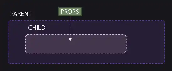
Props: Passing data to the component
The button above is quite useless because it always says “I’m a component!”. We would like to be able to change that text each time we insert the button.
We need it to be dynamic and pass it information. For that, we use Props (properties).
Props are the attributes we pass to the component (just like src or alt in an <img> tag).
For example, let’s improve our button:
---

// We destructure the props to use them easily
// We assign a default value to 'esPrimario' if it's not provided
const { texto, esPrimario = true } = Astro.props;
---

<button class:list={['base', { primario: esPrimario, secundario: !esPrimario }]}>
  {texto}
</button>

<style>
  .base { padding: 10px 20px; border: none; cursor: pointer; }
  .primario { background: blue; color: white; }
  .secundario { background: gray; color: black; }
</style>
In Astro, props are received through the global Astro.props object in the frontmatter. We can use the props as variables during build time.
<Boton texto="Save" />

<Boton texto="Cancel" esPrimario={false} />
Slots: Injecting HTML content
Props are great for passing simple data (strings, numbers, booleans). But what if I want my button to contain an icon, or bold text, or an entire paragraph?
Passing HTML through a prop is complicated and a bad idea. For that, Slots (holes) exist.
The <slot /> element is a placeholder that tells Astro: “This is where you should put anything they place inside my component’s tags”.
To understand it better, let’s improve our button so it accepts any content, not just plain text.
---
const { tipo = 'button' } = Astro.props;
---

<button type={tipo} class="btn">
  <slot />
</button>
Now it’s much more flexible, because the element using it can change the entire button content to any HTML fragment.
<Boton>
  Make <strong>Click</strong>
</Boton>

<Boton>
  <img src="/icono.svg" /> Save
</Boton>
Default Content (Fallback)
You can put content inside the <slot>Default text</slot> tags.
This content will only be shown if the user uses the component empty <Boton />.
Named Slots
What if we need to inject content into several different places within the same component? The classic example is a card (Card) that has a header, a body, and a footer.
For this, we use Named Slots. We use the name attribute in the <slot> tag.
---
const { titulo } = Astro.props;
---

<article class="card">
  <header>
    <h2>{titulo}</h2>
    <slot name="header-icon" />
  </header>

  <div class="content">
    <slot />
  </div>

  <footer>
    <slot name="footer" />
  </footer>
</article>
Now to send content to a specific slot, we use the slot="slot-name" attribute on the HTML element we are injecting.
---
import Card from '../components/Card.astro';
---

<Card titulo="Learning Astro">

  <span slot="header-icon">🚀</span>

  <p>This is the main content of the card.</p>
  <p>We can put several paragraphs.</p>

  <button slot="footer">Read more</button>

</Card>