
The content of this post is the result of the combination of an engineer and boredom. The story of a Sunday afternoon with nothing to do, where by chance it ended up on one of the countless pages where a supposed expert is convinced of being an Excel “guru” for explaining how to make a bar chart.
Driven by sheer boredom, being a restless soul, and a manifest inability to spend an afternoon on a sofa doing nothing, I started playing with charts in Excel sheets to experiment to what extreme level of madness they could be pushed.
Basic Level
The first experiment on this boring afternoon, not yet knowing where it would lead, was to draw a flower using functions. It is composed of 7 sinusoidal functions (half period), properly shifted, rotated, and scaled, to form the final figure. A quick, fairly easy exercise, whose result is the following. 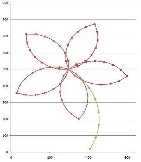
Advanced Level
Logically, the first experiment left me cold. No matter how pretty the little flower is, it’s still a figure composed of simple segments made with elementary functions. Could it be taken further? Could it be extended to a method for tracing arbitrary figures?
To test the concept, I drew a snail using splines in AutoCAD. Later, I programmed a VBA routine that exports the coordinates of the interior points of the different splines, distributed uniformly based on the local curvature. The result is a general method that allows transferring any arbitrary vector image into an Excel chart, and an example of which is the following: 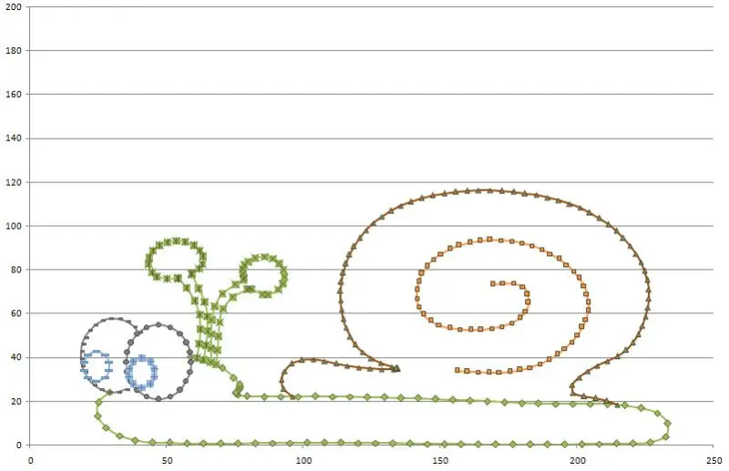
Extreme Level
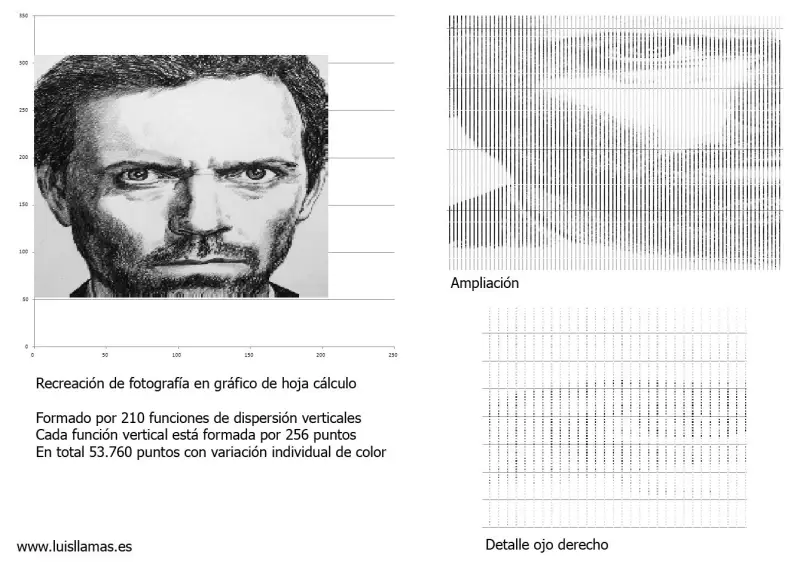
The previous experiment left me much more satisfied. Indeed, I could convert any vector drawing into an Excel chart. This includes vectorizing any image and importing it into Excel. But could something truly extreme be done, pushing charts in Excel sheets to a paranoid level? Could I directly encode a bitmap image?
No sooner said than done, I started programming a small .NET application that, from an image, creates a gigantic scatter chart, varying the color of each node based on the interpolated data from the image. The result, tested with the image of House (Hugh Laurie), is the following:
That concludes the round of experiments to push charts in Excel sheets to extreme, paranoid, and absurd levels, with no other reason than to practice and play.