
HandyControl is an Open Source user interface (UI) component library for C# and WPF that provides a wide variety of controls and utilities.
WPF as a development technology isn’t bad, especially considering it’s a product that emerged in 2006.
Although it remains an actively used technology, and is recommended by Microsoft (after a period where it was nearly obsoleted), the truth is that its age shows.
Therefore, it is very convenient to equip ourselves with a good collection of libraries that facilitate our work when we want to tackle a project with WPF.
HandyControl adds a huge library of components for WPF that significantly speeds up desktop application development.
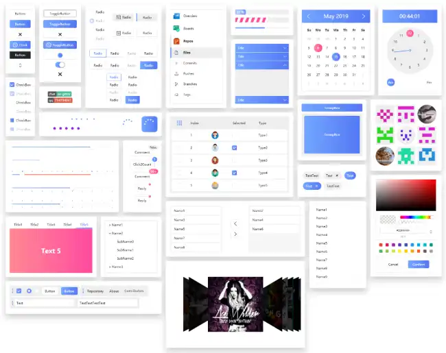
It features over 80 controls, which we can customize or use in our projects to give them a more modern and updated aesthetic.
Among them, we find buttons, menus, windows, tables, grids, trees, loader indicators, progress bars… among many, many others.
How to Use HandyControl
We can add the library to a .NET project easily, through the corresponding Nuget package.
Install-Package HandyControl
Next, we add the reference to the HandyControls namespace in our XAML file.
xmlns:hc="http://schemas.handyorg.com/2009/xaml/presentation
Now we can use the controls in our view. For example, suppose we want to create a circular progress bar. We would simply do:
<hc:CircularProgressBar Value="50" Maximum="100" />
This will create a circular progress bar, with a current value of 50 and a maximum of 100. Of course, we could bind the properties or customize the options.
There are many controls available, each with a large number of options for customization. If you have to program in WPF, take a look at the available controls because it’s a very complete library.
HandyControl is Open Source, and all the code and documentation is available in the project repository at https://github.com/HandyOrg/HandyControl