Today we are going to see how to apply a Material Design aesthetic to our web page easily with the help of Material Design Lite.
There are different ways to generate a web page with a Material Design look, Google’s popular design guidelines for user interface development. Popular alternatives like Materialize or Google’s own Material UI.
However, most of these methods require heavy use of Javascript, frameworks, or much heavier and more complex solutions based on NodeJs (with code transpiling, Typescript, etc…).
As an alternative, in July 2015 Google published Material Design Lite, a front-end library designed to change the look of a web page, entirely focused on providing a simple and lightweight solution.
Material Design Lite (MDL) works with CSS stylesheets and minimal Javascript, without the need for heavy frameworks or additional libraries. It is optimized for multiple devices and runs on practically any file browser.
MDL is so lightweight that it is even a good alternative for pages served from IoT devices like the ESP8266 or ESP32. The processing load is minimal, as the content is downloaded from Google’s CDN and execution happens on the client, so the server load is minimal.
Material Design Lite Example
Let’s see an example of Material Design Lite in action, and how easy it is to integrate into an existing web page or a small app.
First, we create an html file in any folder on our computer, for example ‘index.html’. We copy the following content, which is a simple example with standard controls.
<!doctype html>
<html class="no-js" lang="">

<head>
  <meta charset="utf-8">
  <meta http-equiv="x-ua-compatible" content="ie=edge">
  <title></title>
  <meta name="description" content="">
  <meta name="viewport" content="width=device-width, initial-scale=1">
</head>

<body>
  <div>
    <div>
      <form action="#">
        <div>
          <input type="text" id="sample3">
          <label for="sample3">Text...</label>
        </div>
      </form>
    </div>
  </div>

  <div>
    <div>
      <button>
        <i class="material-icons">add</i>
      </button>
    </div>
    <div>
      <button>Button</button>
    </div>
  </div>

  <div>
    <div>
      <input type="range" min="0" max="100" value="25" tabindex="0">
    </div>
  </div>

  <div>
    <div>
      <label or="checkbox-1">
        <input type="checkbox" id="checkbox-1" checked>
        <span>Checkbox</span>
      </label>
      <label for="checkbox-2">
        <input type="checkbox" id="checkbox-2">
        <span>Checkbox2</span>
      </label>
      <label for="checkbox-3">
        <input type="checkbox" id="checkbox-3">
        <span>Checkbox3</span>
      </label>
    </div>
  </div>

  <div>
    <div>
      <label for="option-1">
        <input type="radio" id="option-1" name="options" value="1" checked>
        <span>First</span>
      </label>
      <label for="option-2">
        <input type="radio" id="option-2" name="options" value="2">
        <span>Second</span>
      </label>
      <label for="option-3">
        <input type="radio" id="option-3" name="options" value="3">
        <span>Third</span>
      </label>
    </div>
  </div>

  <div>
    <div>
      <label or="switch-1">
        <input type="checkbox" id="switch-1" checked>
        <span>Switch</span>
      </label>
    </div>
  </div>
</body>

</html>
We double-click (we don’t even need a web server like XAMPP) and the result we will see is the following.
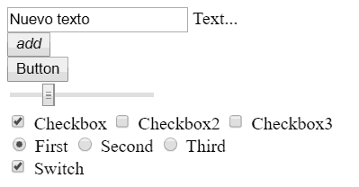
It’s not exactly spectacular. Now, let’s convert this simple example to a Material Design aesthetic. To do this, we copy the following example,
<!doctype html>
<html class="no-js" lang="">

<head>
  <meta charset="utf-8">
  <meta http-equiv="x-ua-compatible" content="ie=edge">
  <title></title>
  <meta name="description" content="">
  <meta name="viewport" content="width=device-width, initial-scale=1">
</head>

<body>
  <link rel="stylesheet" href="https://fonts.googleapis.com/icon?family=Material+Icons">
  <link rel="stylesheet" href="https://code.getmdl.io/1.3.0/material.indigo-pink.min.css">

  <div class="mdl-grid">
    <div class="mdl-cell mdl-cell--4-col">
      <form action="#">
        <div class="mdl-textfield mdl-js-textfield mdl-textfield--floating-label">
          <input class="mdl-textfield__input" type="text" id="sample3">
          <label class="mdl-textfield__label" for="sample3">Text...</label>
        </div>
      </form>
    </div>
  </div>

  <div class="mdl-grid">
    <div class="mdl-cell mdl-cell--1-col">
      <button class="mdl-button mdl-js-button mdl-button--fab mdl-js-ripple-effect mdl-button--colored">
        <i class="material-icons">add</i>
      </button>
    </div>
    <div class="mdl-cell mdl-cell--1-col">
      <button class="mdl-button mdl-js-button mdl-button--raised mdl-js-ripple-effect mdl-button--colored">Button</button>
    </div>
  </div>

  <div class="mdl-grid">
    <div class="mdl-cell mdl-cell--4-col">
      <input class="mdl-slider mdl-js-slider" type="range" min="0" max="100" value="25" tabindex="0">
    </div>
  </div>

  <div class="mdl-grid">
    <div class="mdl-cell mdl-cell--4-col">
      <label class="mdl-checkbox mdl-js-checkbox mdl-js-ripple-effect" for="checkbox-1">
        <input type="checkbox" id="checkbox-1" class="mdl-checkbox__input" checked>
        <span class="mdl-checkbox__label">Checkbox</span>
      </label>
      <label class="mdl-checkbox mdl-js-checkbox mdl-js-ripple-effect" for="checkbox-2">
        <input type="checkbox" id="checkbox-2" class="mdl-checkbox__input">
        <span class="mdl-checkbox__label">Checkbox2</span>
      </label>
      <label class="mdl-checkbox mdl-js-checkbox mdl-js-ripple-effect" for="checkbox-3">
        <input type="checkbox" id="checkbox-3" class="mdl-checkbox__input">
        <span class="mdl-checkbox__label">Checkbox3</span>
      </label>
    </div>
  </div>

  <div class="mdl-grid">
    <div class="mdl-cell mdl-cell--4-col">
      <label class="mdl-radio mdl-js-radio mdl-js-ripple-effect" for="option-1">
        <input type="radio" id="option-1" class="mdl-radio__button" name="options" value="1" checked>
        <span class="mdl-radio__label">First</span>
      </label>
      <label class="mdl-radio mdl-js-radio mdl-js-ripple-effect" for="option-2">
        <input type="radio" id="option-2" class="mdl-radio__button" name="options" value="2">
        <span class="mdl-radio__label">Second</span>
      </label>
      <label class="mdl-radio mdl-js-radio mdl-js-ripple-effect" for="option-3">
        <input type="radio" id="option-3" class="mdl-radio__button" name="options" value="3">
        <span class="mdl-radio__label">Third</span>
      </label>
    </div>
  </div>

  <div class="mdl-grid">
    <div class="mdl-cell mdl-cell--4-col">
      <label class="mdl-switch mdl-js-switch mdl-js-ripple-effect" for="switch-1">
        <input type="checkbox" id="switch-1" class="mdl-switch__input" checked>
        <span class="mdl-switch__label">Switch</span>
      </label>
    </div>
  </div>

  <script defer src="https://code.getmdl.io/1.3.0/material.min.js"></script>
</body>

</html>
Where we have only added the stylesheets for the icons and the Material Design theme in the body header, the MDL Javascript at the end of the document, and added the appropriate MDL classes to the elements in the example.
If we double-click on the file, we will see the following.
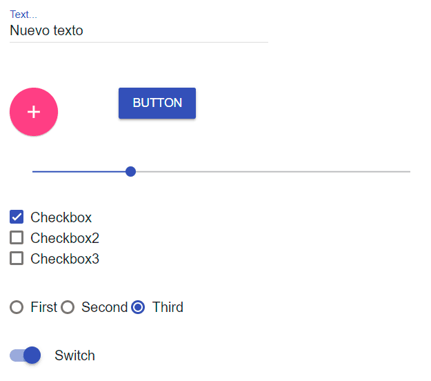
Much more pleasant to the eye and it couldn’t be simpler!
As we can see, setting up the aesthetic is as simple as assigning the MDL classes to the elements. At first it may seem a bit overwhelming, but they are fairly fixed combinations for each element, so it’s actually quite simple.
To learn about the classes, consult the documentation at https://getmdl.io/components/. It has well-organized examples by category of all available elements.
In short, a great alternative for quick, small developments, compared to more complex options. Furthermore, it fits perfectly with other frameworks like VueJS and, in general, in applications for IoT on embedded devices.
Material Design Lite is Open Source under the Apache-2 license, and the code is available at https://getmdl.io/. The original team no longer adds features, but still accepts improvements developed by the community.